A Rebranding Reveal: Woodtryst
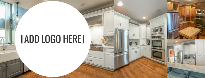
Through the joy that is Facebook Groups, the owners of Woodtryst, a custom cabinet and furniture company in Chattanooga, reached out for help rebranding their company beginning with a new logo. They had reached a point in their growth where the current logo just didn’t represent their company anymore (Sign 1 it’s time for a rebrand) and the last graphic designer they worked with couldn’t elevate their brand to the level of clientele they wanted to attract.
The Before
Here’s the original logo for their brand:
The Process
With a sketch of their new logo in hand and Pinterest board of inspiration, they came to us in need of a quick turnaround on an amazing new logo. The client on-boarding process included Woodtryst filling out our rebranding questionnaire to really get to the heart of what they like, didn’t like, represented and who they wanted to reach.
We once again partnered with the Elizabeth Imber, the owner and lead designer of Pomp Creative, to create a graphic representation of the vision Woodtryst had for their logo and the facets of the brand we knew they needed to convey, including:
- Company name (a given)
- Quality of service
- Target clientele
- Level of creativity
- Experience in the business
- Material of expertise (i.e. wood!)
The Result
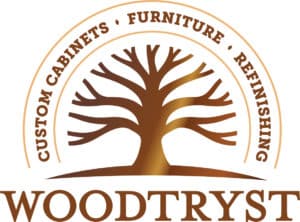
A few strategy calls, client discussions, and design magic later, here’s the final redesigned logo:
It’s clean, dimensional (as opposed to flat color) and showcases the quality of the work this company provides. Mission accomplished.

