
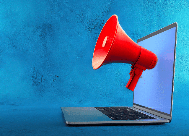
How to Launch a Website Announcement Campaign That Gets Results
Let’s talk about announcement campaigns—specifically, website announcement campaigns.
This is the first post in the new “Announcement Series” where I’ll share frameworks for effectively communicating big company updates or milestones.
The urgency of this series hit me after seeing yet another Instagram post that said:
“We’re excited to share that we are [insert big news]. Check the link in our bio for all the details.”
Cue the intimate face-palm moment 🤦🏻♀️
This tells the reader nothing. But it does give them every opportunity to either freak out about the implications as a client/vendor/employee… or simply unfollow because vague posts are annoying AF.
If you’re going to share a message, key detail here: actually share the message.
So today we’re going to talk about just that: how to determine the right messaging for your website announcement campaign. Then next week I’ll provide the exact framework to use for sharing the message to your network.
Why Your Website Announcement Needs More Than “We Have a New Site!”
So, let’s walk through an example.
You’ve got a redesigned website (likely by DCM 😉) and want to share it with the world.
The first instinct is usually something like:
“We have a new website!! Go check it out.”
Here’s the problem:
No one, except the people who worked on the site and maybe your [insert important person in your life], is going to care enough to actually click. They’ll either Like the post, leave a quick “Congratulations!” comment, or scroll on by.
Instead of focusing on what you want, put yourself in the reader’s shoes and ask:
“Why would they be interested in looking at the new website?”
Examples of Reader-Focused Website Announcement Messaging
Instead of “we have a new website” messaging, here are some alternatives from the reader’s perspective:
Message: “We heard your request and have expanded our [service/offering] to better serve you.”
Landing page: Top-level Services page
Message: “Your Pinterest mood boards are about to get even better! Explore our updated portfolio and get inspired for your big day.”
Landing page: Portfolio page
Message: “Trivia time! Who on our team [fun fact/unusual hobby]? Drop your guess in a comment and then find out the answer here [URL]. All correct answers will be entered into a drawing to win [incentive].”
Landing page: Team page (with bios)
You may have noticed that every one of these has a different landing page and NONE of them are the homepage. Why? Because the homepage is not the priority.
The real priority is getting them to your website and creating the most seamless user experience possible. The post/email starts the conversation and the landing page continues it.
Why the User Experience Matters Most
Once someone is on your site and has a positive experience (i.e., you didn’t make them click three times to find the info), they’ll likely stick around to explore more. The longer they are on the website the better for both conversion likelihood and your organic search rankings.
Extra clicks to get an answer = higher bounce rates
Because really…
Now that we have the messaging clear, come back next week to get the framework for how you roll this out to your network and truly get the most traffic possible to your beautiful new website.
Make sure you’re part of the Inner Circle so you get an email as soon as it’s live!

What Taylor & Travis’s Engagement Can Teach You About Making a Big Business Announcement
Learn how Taylor Swift & Travis Kelce’s engagement reveal offers PR lessons for your

The Step-By-Step Framework for Announcing Your New Website
Learn the step-by-step framework to announce your new website. From email to social media,

3 Effective Marketing Tasks You Can Knock Out in Under 20 Minutes
Pressed for time? Try these 3 quick marketing tasks—each under 20 minutes—to stay consistent,