Why This Form Mistake Is Costing You Conversions (And How To Fix It)
A few weeks ago, I got an email promoting an upcoming event. The message in the email did its job, making me curious to learn more.
After clicking through to the landing page, I decided to attend and clicked the coveted “Register Now” button.
Then I hit this screen 👇🏻
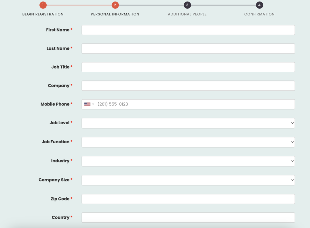
I’m sorry, what? 😳
“Do you want my mother’s maiden name and favorite childhood pet while you’re at it?” I thought.
I’m betting you can guess what happened next.
I left the page, bounced, became another one of the negative statistics on this company’s website analytics report, all for one very simple reason:
They made it too difficult for me to become a customer!
Here’s how you can learn from their mistakes.
The Fastest Way to Sink a Website Conversion
You can have the absolute best marketing strategy, website design & copy, and brilliant calls to action, BUT…
None of that will matter if the target hits the conversion page and is confronted with 10,000 fields of personal information.
The more fields you put on your form, the lower your conversion rate will be. Period.
People do NOT have that kind of time on their hands to give you.
Yes, I know you’d like to know all these details so you can (if you follow DCM email marketing guidance) segment the heck out of them for future marketing efforts. However, this is not the time and place for that.
What To Do Instead
Rather than hit people with too many form fields, knowing the addition of each one lowers the conversion rate, request only the most pertinent information to close.
This could look like:
→ First Name
→ Email
OR..
→ First Name
→ Email
→ Phone
→ Service/Date of Interest
OR..
→ First Name
→ Last Name
→ Email
→ Service/Date of Interest
(NOTE: You can also add a “Message” or “Additional Info” field if it’s a contact-style or general inquiry form, but that should always be optional. Event registrations, requests for services, etc should always be as little info as possible to move them to the next stage: a 1-1 follow up.)
The only time it’s acceptable to have more (required) fields up front is when it’s an eCommerce transaction, in which case the buyer has gone into the interaction knowing they will need to provide more info.
All the other info you want to know, but do not need to know to get them to the 1-1, can be asked on that followup or gathered naturally during the onboarding process, another point in time when someone expects to be providing more information up front.
Increasing Your Website Conversions: Key Takeaways
Yes, it’s really that simple:
Minimize the form fields → maximize the website conversions → qualify on a phone call or 1-1 email
That 1-1 element is key for all service-based businesses. Taking the time to get on the phone, or email personally, to qualify them will also increase your close rates.
After all, they are reaching out for a service, which is going to be provided by a human. So let’s get a little personal shall we?
[soap box descended]

