
The Biggest Branding & Design Mistakes Event Pros Make & How to Fix Them
By nature of being an event professional, you’re creative, right? That creativity is what allows you to take a blank space and turn it into a jaw-dropping experience.
But when it comes to your branding and website, that same creativity can either work for you—or against you.
Let’s walk through some of the biggest branding mistakes I see event professionals make and, more importantly, how to fix them so they don’t cost you sales.
Mistake #1: Forgetting That Brand Is More Than a Logo
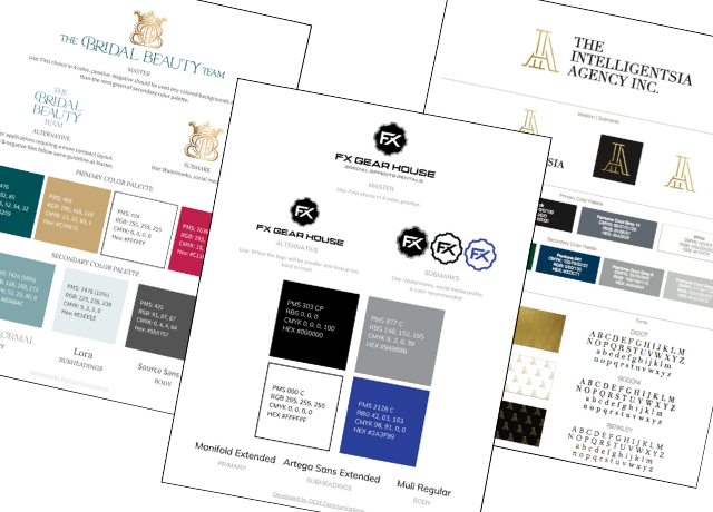
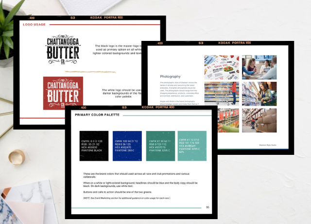
Branding isn’t just about a pretty logo, as much as I do love them—it’s your entire identity on- and off-line. That includes:
➜ Color palette
➜ Typography
➜ Tone of voice
➜ Visual style
➜ Personality
If you only focus on the logo and neglect these other elements, your brand will feel disjointed and inconsistent from one platform (or event) to another.
Clients want to hire the professional who has their sh*t together, so let’s make sure you’re just as buttoned up internally as I know you are when it comes to executing flawless events for them.
How to Fix It:
Create a brand guide that defines all these elements so you can maintain consistency across your website, social media, proposals, and marketing materials.
Mistake #2: Getting Too Creative with Website Design
Look, I get it. Playing with design is fun. I do it in the digital space, you do it in the real world.
But your website and marketing collateral exists to showcase your work, not compete with it.
All of your marketing materials—from the website to the tradeshow flyers & collateral—should allow potential clients to see themselves in the experiences you create.
If you employ all of your brand colors or the patterns and textures are too strong, they can overpower your actual work—making it harder for clients to envision what you can do for them.

How to Fix It:
1. White Space Is Your BFF – Just because you can put a color in the background doesn’t mean you should. White space helps direct attention where you want it—on your work.
2. Follow the 4x4x4 Rule for Color Usage – Keep your design clean and cohesive by limiting your brand’s palette:
➜ 4 Primary Colors
➜ 4 Secondary Colors
➜ 4 Colors Per Design
This keeps things from getting chaotic. When using event photos (which are naturally more colorful), limit your brand colors in the design even further to avoid visual overload. (No Monet’s allowed 🙅🏻♀️)
3. Use Texture Thoughtfully – If all-white backgrounds feel too stark for you, introduce subtle textures in your brand colors at low opacity. A simple brushstroke or gradient can add dimension without stealing the spotlight from your event photos.

Before
")
After
Mistake #3: Not Letting Your Work Be the Star
Your potential clients want to see what you can create for them. But if your marketing designs or intricacies of your brand overshadow your work, they may never get the full picture.
How to Fix It:
➜ Keep your layouts clean and let event photos take center stage
➜ Use neutral or muted brand colors around imagery instead of bold, competing hues
➜ Ensure your website is designed with the user experience in mind—easy navigation, clear messaging, and a focus on your portfolio.
Branding Should Elevate, Not Overpower
The goal of branding is to clearly illustrate you as the best choice for your ideal clients. If your branding is too strong or complex in your marketing materials, it can distract from the incredible work you do. If it’s too weak, it won’t make an impact.
The sweet spot? A strategic brand that enhances your work and makes it easy for potential clients to see exactly why they need to hire you.
Ready to refine your branding and make sure it’s working for you instead of against you? Let’s chat!

What Your Out Of Office Message Says About Your Brand
Your out-of-office reply does more than tell people you’re gone. See how a thoughtful

Tagline vs. Brand Positioning Statement: Definitions & How To Use Them
Struggling to define your brand messaging? Learn the key differences between a tagline and
Why Every Business Needs Brand Guidelines and How to Get Started
Discover the importance of brand guidelines for your business. Learn what to include to