How to Avoid This Common Email Marketing Mistake
I see this everyday and each time it makes me cringe. To the point that I am now going to educate y’all on the most common email marketing mistake I see.
Picture it:
A marketing email lands in your inbox. It’s HTML and has image(s) included.
You read the copy and are enticed by what is written so you click on the image.
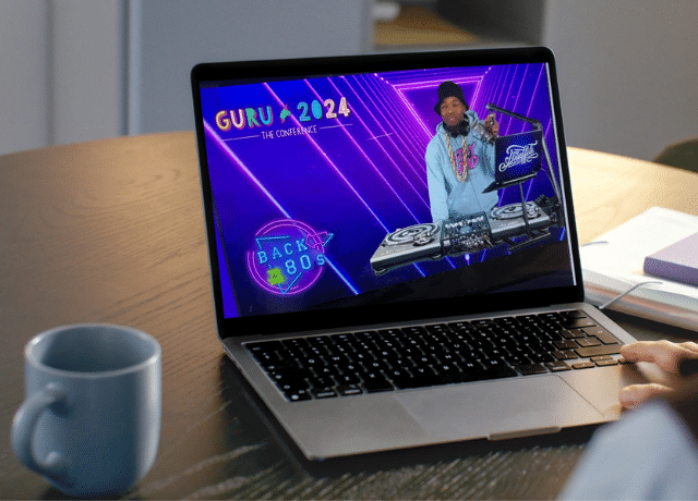
Then, instead of being directed to a landing page with more info, you get this 👇🏻
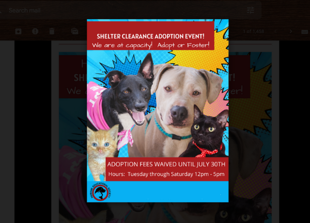
The image simply gets bigger and your inbox fades to the background. Does this sound/look familiar?
Why This is A Mistake
By not linking this image, the sender has not only missed out on an opportunity to get me to their landing page where a conversion happens, but they have also put the burden on me to find yet another place to click to get to what they want me to see.
So instead of one action, the recipient now has the burden of taking three:
-
- Click image, which leads them nowhere 👎🏻
- Find another potentially linked button or text to get more info
- Click that second place hoping to get another action
What do you think the odds are of someone taking 3 actions when they could have just taken 1? Exactly! Pretty small. Save your recipients the trouble and make it as easy as possible for them to get to your website by linking everything to your intended destination.
What To Link in All Emails
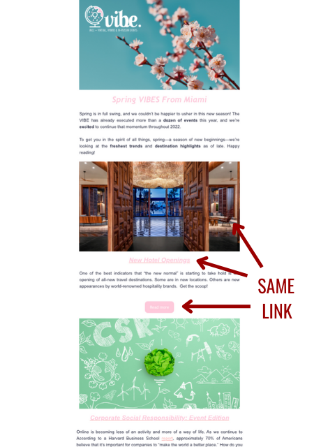
When I say “linking everything” I am being pretty literal. Let’s take an email newsletter for example. It may look something like this one from VIBE Agency in Miami (a proud DCM client).
Example A
In this case, the image, headline and button should all link to the intended destination for that article.
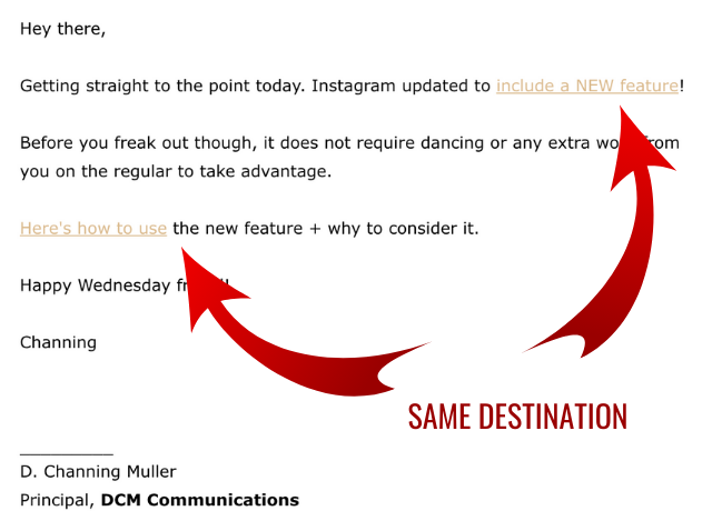
Example B
On the other hand, if you are sending out a simple text email to alert subscribers of an upcoming sale or new blog post, such as I do (*cough* get on the list here *cough*) then you want each instance where you mention the destination to be linked.
Yes, one email with multiple links to the same destination. Why? Because the goal is to make it as easy as possible for your recipients to get to the destination.
In Example A, some will click on the image, others will click the button.
In Example B, some will be enticed enough by the first mention of the article, whereas others will read the full email before they decide to click.
By linking multiple times you are increasing the likelihood of capturing a conversion (i.e. a click) no matter how your recipients behave.
The Main Point
You’ve put in the time to create great content and snappy graphics/copy that get your email list interested enough to take an action. Don’t miss the boat on that conversion because you forgot to link a graphic.

