Take Your Website Conversions to the Next Level with This Easy Fix
You designed a website. Whether for your business or an event, you want people to see your website, like the content and convert, right?
When I say “convert”, I am referring to someone filling out a form. That form could be to register for your event, contact you for information, download something, join a private list, etc.
The goal is the same across the board:
Get a user to fill out a form on the website.
However, that doesn’t always happen. In fact, if you are committing this all-too-common error then you may be inadvertently hiring your own chance.
The good news: It’s SUPER simple to fix!
The Reason Website Visitors Aren’t Converting
Now let’s first assume you are presenting amazingly wonderful content on your website. You have honed in on your ideal client, know the services/products/content they want, and you’ve designed a website in a pretty, yet effective, way to give it to them.
You have also promoted that website through social media & content marketing to bring in visitors on a regular basis.
BUT, you are not seeing them convert to leads (or customers). Why? You think you are doing everything right.
If you see (via analytics) that visitors are reaching that form page, but they aren’t getting past it, then you have likely committed this common mistake.
The reason users aren’t converting to leads or customers is because….
The form has too many fields!
Yep, it’s that simple.
Let me give you an example.
I recently received an email from a business promoting an upcoming webinar that seemed interesting so I clicked the email’s “Register Now” button. (Using that phrase is another common mistake that reduces leads, but that’s another article entirely.)
The landing page I’m directed to reinforces the email’s message (as it should) so I confirm my “Register Now” selection and am hit with this:
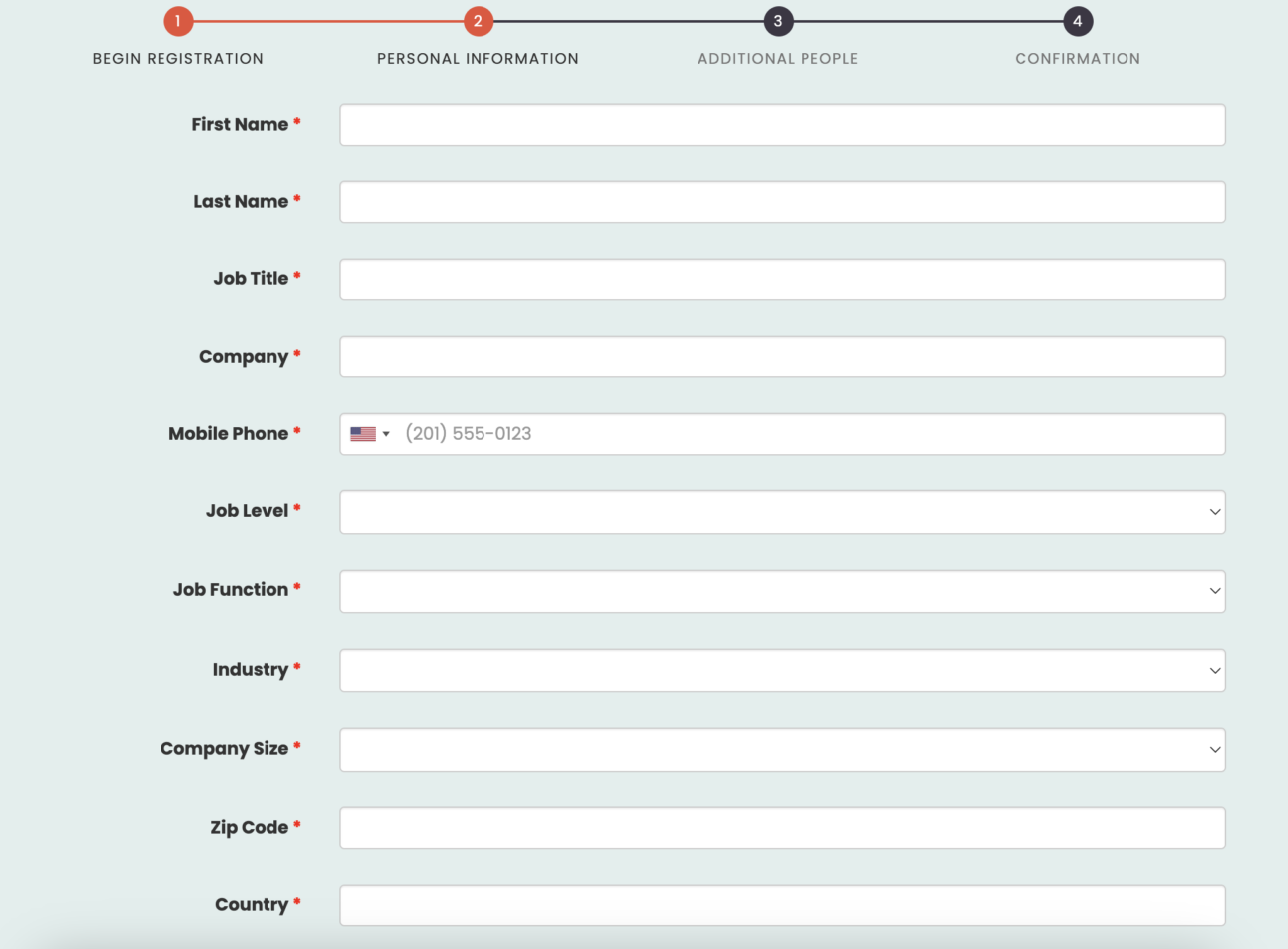
Y’all, you have GOT to be kidding me🤦🏻♀️ I’m surprised they didn’t ask for my height and weight as well. Because this is a frequent mistake I see on websites, I continued through the process just to see how much worse it could get.
It got worse. It took me nearly 4 minutes, rather than 60 seconds (tops!), to fill in all the details and get to the end. That is WAY too long and most people who had even a cursory interest in the webinar would have bounced.
The Simple Fix to Improve Your Conversions
While some may argue that having all these fields would deter the cursory interests or tire kickers, the issue here is that you are asking a lot of personal information from someone before they even really know you.
It’s the equivalent of being invited for a weekend away with someone you have yet to go on a first date with. It’s just too soon.
The only fields that should have been on this form are:
First Name*
Last Name
Email*
Company OR Job Title
If it’s an appointment scheduling form, then you can have:
First Name*
Last Name
Email*
Phone*
One additional question field
If it’s a event ticketing form, use these to start: (assuming you followed these rules about ticket
First Name*
Last Name*
Email*
Billing Street Address*
Address line 2
City*
State*
Zip Code*
CC Number*
Expiration Month/Year*
CVV*
Name on Card (if different from above)
Notice the fields I marked as required (*). You may want a ton of other details about someone, but you cannot overwhelm them with that at the forefront if you want to get leads in the door.
(NOTE: If you already have this simple form on your event ticketing website and still are not seeing conversions, you may need to look back at your ticket tiers. This layout will help them be easily understood & lead to buying.)
Why This Fix Matters
Would you go on a first date and ask someone for every detail of their childhood AND how much money they make? Never! (Not if you wanted a second date at least.)
Remember that “Know Like Trust” marketing principle?
When it comes to that first conversion on the website, you are in the “know” phase. Maybe the “like,” but that’s a big maybe. You are nowhere near the “trust” (yet) so you need to cool your jets.
Get someone to fill out the first form by asking for the bare minimum amount of information you need to continue the relationship to the next step.
Then once you have your first date (i.e. qualifying call, download + funnel emails, event, etc) you can ask them for more information.
Until then, keep your conversion high and bounces low by remembering what it’s like to be on a first date and avoid proposing marriage right away.

