When A Pretty Logo Is No Longer the RIGHT Logo
Everyone wants to have a beautiful logo for their business or personal brand, right? Sure. No brainer. However, “pretty” shouldn’t be your only goal.
You need to make sure the logo is designed to accurately represent what you do AND who you are. Here’s a case study example of what I mean:
The “Before”

The Analysis
Was Marie King’s “before” logo good? Yeah! It was well balanced, sleek and very corporate.
The problem: It wasn’t really Marie.
For anyone who’s met her, she is a much more free-spirited, bohemian, conversational and relaxed person. She puts her clients (and anyone who meets her really) at ease. She loves flowing dresses, creative patterns and getting business done!
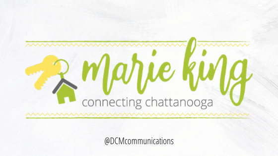
She’s got 20 years in the Chattanooga real estate market to back up her expertise. With this redesign, we needed to blend the bohemian with the professional; the patterns with purpose (residential real estate).
The Results

This logo with its iconography, flowing and open typography and recognizable “Marie King” green combined with her tagline lockup of “Connecting Chattanooga” integrates what she does (sell houses in Chattanooga) with who she is (a relaxed and fun realtor with recognizable brand equity in the market.)
I am proud to have worked on this with my BFF and graphic designer extraordinaire Kellie Ward who brought this vision and strategy to life.


