Brand Guides: Why Your Business Needs One And What to Include
When first starting your business there are a variety of things you think about as far as necessities:
- Company name
- Offer/product
- Set Prices or Rates
- Contract template (hopefully this is on your list. And if not, here’s why it should be)
- Website (small though it can be, this is a must-have)
Sometimes you want to throw a logo into the mix. If you’re starting your business with capital or already have some freelance income, then creating your overall brand isn’t a bad idea. A brand is more than just a logo though. It includes your typography, color palette, tone of voice, and photography style.
A brand is more than just a logo
Getting the Most ROI from Your Marketing Investment
Creating a new brand, particularly if you are hiring an expert to do so, it’s not an expensive venture. And let me be clear: if someone is charging you only $500, they are either a student and/or using stock and not something custom for you. In either case, they are not an experienced professional so go into those deals with your expectations in alignment to what you are paying.
The way you get the most out of that investment, whatever the amount, is by ensuring all of your future marketing sticks to the brand that’s been created.
This is where brand guidelines come into play. You can have basic ones or really in-depth ones. A lot of it depends on the size of your business and what stage you’re at.
Let’s break down the two types and when you will use them:
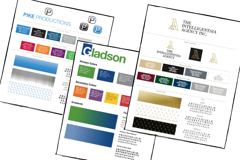
Type 1: Basic Guidelines or a Brand Board
This is a simple blueprint for how your brand should be represented in all graphic elements including your website, advertisements, custom graphics for social media, deliverables you provide to clients, product marketing material, etc.
Every business that has a name should have a one pager including the following:
- Typography to use for both headings and body copy
- Color palette of at least three colors with full color codes (RGB, CMYK and HEX)
- Examples of each version of your logo (master, alternative and submark) and explanations of when/how to use each
This instruction gives you and your team (employees or contractors) the exact parameters to stick to so no matter who creates the contact, your brand looks consistent across the board and avoids you having four different shades of blue across four different materials when your brand truly only has one in its color palette.
Too many colors = messy brand.
Type 2: The Complete Brand Guide
As soon as you are more established and bringing in at least $50,000 a year then I believe it is worth upgrading to a complete brand guide.
This includes everything in the above version, plus:
- When to use each color version of your logo (full color, solid primary color, white and black)
- Examples of correct and incorrect usage of your logo including:
- color backgrounds that can and cannot be used with each version and color
- proportions for how it should show up. This will also include some distortions to illustrate the incorrect way for a logo to be used
- Rules for photography
- overall style and angle of photographs as well as whether or not they have any filters or overlays permitted.
- Notes on tone of voice for all copy in the Typography section
The larger your company grows and the more people you have working for you, the more important it will be to have a complete brand guide as there will be multiple hands in the pot. As the business owner, you want to make sure that the brand you created, or invested in someone else creating, stays true across all areas of your company.
Each of these guidelines should be sent to all employees so that any original contact they are producing is consistent with the brand you want presented. This includes proposals that are sent out, presentations that are given in person or emailed, marketing content, and anything else that is public-facing.


