How To Create Your Website Architecture
(Updated 8.4.2025)
Picture this:
You go to an event (networking or social) and are introduced to someone new. As you begin to talk to them, you find out they are the epitome of BOR-ING!
They really don’t have much interest to say and really can only talk about a single subject with zero variance in how they approach it. They’re like Flat Stanley in human form.
No matter how much you want to talk with them about something else and stealthy try to change the topic, they always go back to saying the same thing and no even in a new way.
Sound familiar?
That person is what you would call one-dimensional. They don’t really have a lot to say and what they do say makes you want to leave as soon as you can.
No one likes a one-dimensional person and search engines feel the same way about websites. They want depth, value and evolution in a website just like we do in a person.
Creating Search-Friendly Websites
It all begins with your top level of pages. These are the ones in the main navigation, often known as Parent Pages.
Now as one would expect, you can’t be a parent without having a child (biological or otherwise) so, that inherently means these top level pages need Child Pages.
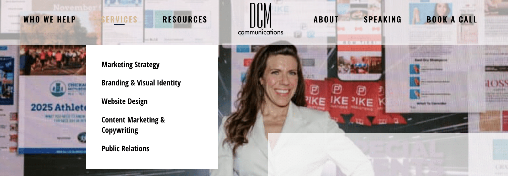
Child pages are what often appear in the drop down of a main navigation when you hover over one of the options. These provide even more detail than their parent pages and are hyper-specific to a given service or topic.
So if you are service business, you may have a “Services” or “What We Do” page and below that a separate page for each of the services you provide your customers.
Example:
But, don’t get carried away with the child pages…
While Google, Bing and any other search engines you want to use appreciate some level of depth, the user experience is paramount to everything else.
Meaning, if you provide so many pages that your website visitor has to keep clicking in order to get to the meaty information they are searching for, then Google will knock you down in its rankings the way you bat a fly from your food at a picnic.
Flat website hierarchies are the ideal these days, where “flat” refers to up to two levels deep.
The Key to the (Search) Castle
Provide valuable information to your users in an way that’s easy to navigate and access. The better information you have, the longer they will stay on your site.
This tells search engines that showing you as a result was a valuable answer to the query it received because the users they sent stuck around. Keep it up and your appearance in the rankings will continue to improve.


