
Your Email Branding Matters More Than You Think
They say you shouldn’t judge a book by its cover. But people absolutely do.
The same is true of your email marketing.
You may have drafted a masterful piece of content. It’s timely and intriguing. Your subject line hits curiosity and urgency just right to get people to open it. Your calls-to-action are clear and compelling enough to get people to click through.
You can do all of these things right. But if your email looks like a hot mess? None of it will matter.
Your readers are feeling and perceiving things from your email they’re not even aware of.
And just because they may not consciously notice those signals doesn’t mean they aren’t influencing how your brand is perceived.
The way your email marketing is designed matters a lot more than you think. Let’s take a look at why, and how you can make it easier for readers to trust your emails and take the action you want them to.
Your Audience Is Scanning Before They’re Reading
Inboxes in 2026 are more crowded, automated, and visually repetitive than ever. People are making split-second decisions about the contents (based entirely on subject line & sender) before they read a single word.
How much your audience knows, likes, and trusts you plays a major role in whether they choose to do business with you. Signals of familiarity, trustworthiness, and recognition are often the first things their brains are scanning for.
If every email you send looks completely different, you’re making your audience work harder to recognize you every single time.
This also doesn’t mean every single email has to look exactly the same. There are plenty of ways to keep things visually interesting while still maintaining overall consistency, just be intentional about how you approach it.
If you lean too heavily on AI-generated templates or constantly reinvent your layouts, you may end up feeding into the same visual sameness people are already tuning out. (Not to mention frustrating your branding agency to no end.)
Recognition builds trust before the copy ever has the chance to enter the chat.
What Email Branding Actually Includes
Branding your email marketing goes far beyond slapping a logo at the top and calling it a day. (And if this section makes you realize your branding may need some TLC, we’re here to help!)
Everything from layout, typography, sizing, colors, photos and graphics, can help you keep your brand’s identity strong across every single send.
Layout Consistency
Whether you’re using a newsletter template with multiple different sections and images or you’re keeping things minimal with simple text, consistent layouts help signal stability and familiarity to your audience.
Spacing also matters more than most people realize. If you have multiple sections all squeezed together, a scanning audience will tune it out. While we want to give our content space to breathe, we also have to be careful about leaving too much space between sections.
This is especially important on mobile view, so always check your test emails on your phone before sending.

Typography
Most email service providers (ESPs) have a pared down selection of fonts specifically chosen for readability on mobile devices. We always recommend choosing one that most closely matches the body font used on your website.
(NOTE: While the platform may let you upload your brand fonts, they are not always translatable across different ESPs so it could look off for your readers. Again, always test.)
That small consistency from email to website matters more to readers’ brains than you might think!
Pay close attention to letter spacing (kerning) and line spacing (leading), too. If words or lines feel cramped, that visual chaos will have readers tuning out faster than a group text with 47 unread messages 😳.
And here’s our broken record moment:
Always check your typography choices on mobile devices.
The vast majority of people now check email primarily on their phones, so your emails should be optimized for that experience first.
Color & Visual Identity
Your brand colors should be used consistently across all channels. Email is no exception.
But it’s also a great place to make use of some of those secondary colors in your brand palette.
For example, at DCM we use the green from our secondary palette for links in our emails. After testing, we found it consistently improved click rates.
The same goes for buttons. Execute split tests with different options to see what yields better results and then stick with it from send to send.
If you include graphics or images in your emails, use consistent formatting and styling throughout. That could mean all black-and-white photography, the same color overlay treatment, or a consistent illustration style.
The most important thing is to avoid creating a new brand identity every time you hit send.
Voice + Visual Alignment
Last but not least is a little “vibe check.”
What readers read when they open your email should align with what they already know and expect from your brand.
If you’re a luxury brand, cluttered emails with budget-focused copy will feel off.
If you’re a warm, relational brand, sterile corporate emails may feel jarring and disconnected.
Make sure every piece of your email aligns with who you are as a brand.
Simple Ways to Strengthen Your Email Branding
Work through this list one step at a time to make sure your email marketing is sending the right message:
➞ Use 1–2 core templates
➞ Keep typography and CTA styles consistent
➞ Stick to brand colors and consistent visual design
➞ Prioritize mobile readability
➞ Reduce clutter
➞ Review recent emails side-by-side for consistency
A good rule of thumb and guiding question is this:
Would someone instantly recognize these emails as coming from your brand?
If yes, then you’re on the right track.
Consistency → Trust → Performance
Bottom line: familiar emails are easier to trust. And that trust is built from consistency in what you say and how you say it, including the visual cues in your layout, colors, font, and images.
This does not mean that your emails need to be overly designed, but it does mean they need to be recognizable. Your audience should know it’s you before they even start reading.
If all of this sounds great but you don’t have the time (or desire) to figure it out yourself, we’d love to help. Schedule a discovery call.

The Top 4 Mistakes We See With Using AI to Repurpose Content
AI makes it easy to repurpose content but there are four mistakes we see

Why Most LinkedIn Newsletters Feel Forgettable (And How To Make Sure Yours Isn’t)
It's easier than ever to start a newsletter on Linkedin. But growing one is

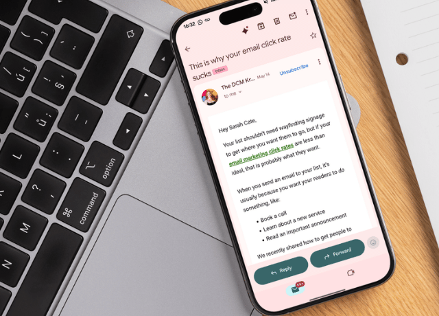
Why Your Email Click-Through Rate Is Low (And How to Fix It)
Getting someone to open your email is one thing. Getting them to actually take